BankBlackUSA Map Redesign
Project Overview
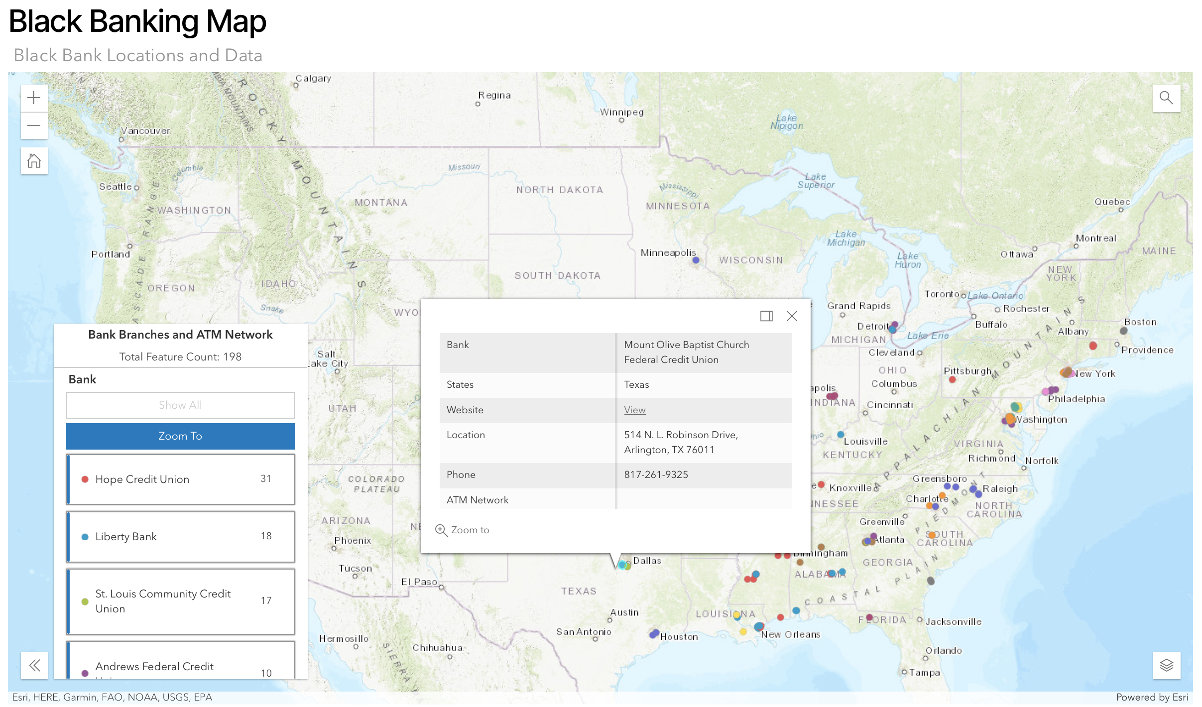
BankBlack USA is an independent, grassroots organization with the goal of connecting individuals with Black-owned banks and credit unions in their area. They work to provide Black communities with financial tools and resources to fit their needs. BankBlack is empowering those individuals to take hold of their finances and improve the overall financial wellness of the Black community in America. My team and I were tasked with redesigning the Black Banking Map that spreads knowledge and educates individuals about Black-owned banking institutions across America.
Project Goals
-
Usability
Improve the usability of the map feature to be more accessible and easier to use with guided navigation
-
Digestability
Make it easier for users to understand and digest the information they need on the map
-
Company Growth
Spread the mission of BankBlack to new users so that they have a stronger understanding of who BankBlackUSA is and what kinds of help they can provide
Research Phase
Survey
Our team created a survey to understand the banking habits of pre-existing BankBlack users, prospective individuals considering switching to a Black-owned bank, and supporters of the BankBlackUSA mission. We created an incentive for users to take the survey by raffling off $25 gift cards to 10 survey respondents. We also included a section in our survey to recruit individuals for usability testing with an incentive of $10 gift cards for 10 participants.
Usability Testing
To better understand how users interact with the map, users who took the survey and indicated that they were interested in participating in a usability test were asked to take part in one. Our team conducted five 30-minute user interviews over video communication platforms, like Zoom. The user was asked questions regarding their intentions when using the map and was instructed to complete a set of tasks with the map feature, then was asked for their opinions on the map as a whole.
Comparative Analysis
Our team identified 5-6 competitors of interest by locating online resources that have interactive map features that relate to the Black community. To assess each competitor, we created a set of criteria that involves utilizing standard UX design choices, such as color schemes, list views, filters, etc., and applying them to each competitor to understand their strengths and weaknesses. These insights will be used to inform design requirements for the next version of the map.
Design Phase
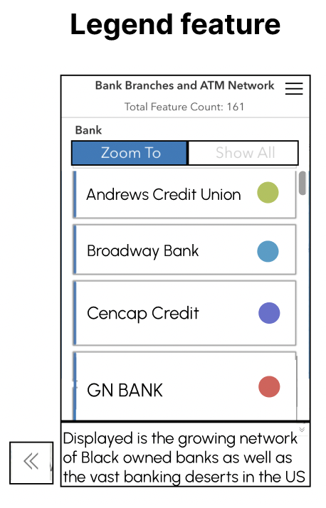
We followed a typical design process in order to get from ideation to high fidelity models of our designs. We started by defining exactly what problems we wanted to solve. We then broke down larger issues we gathered from user testing and divided it into categories by feature. We focused on specific features on the map including the search feature, the legend, and the bank information table. As part of the process of creating the design ideation board, we held brainstorming sessions as a team to flesh out our ideas into more concrete design requirements.
Lo-Fidelity
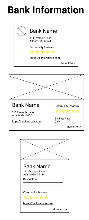
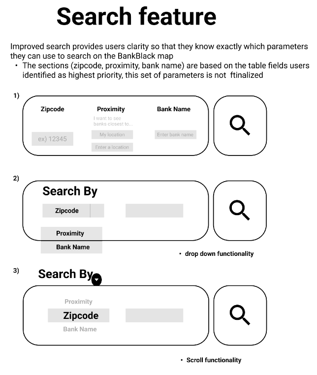
Mid-Fidelity
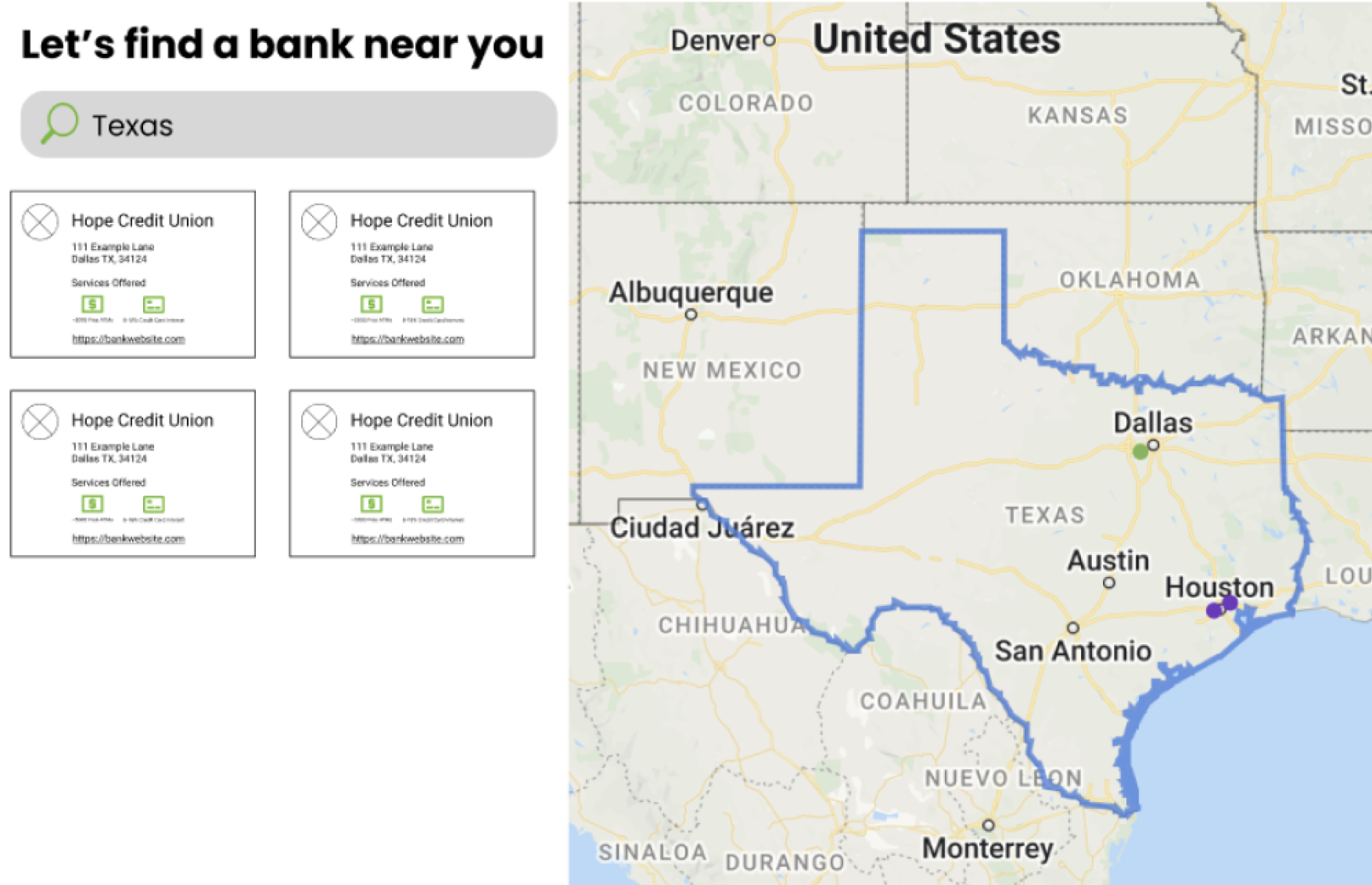
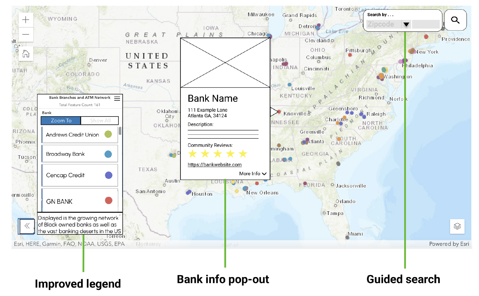
Hi-Fidelity

Evaluation Phase
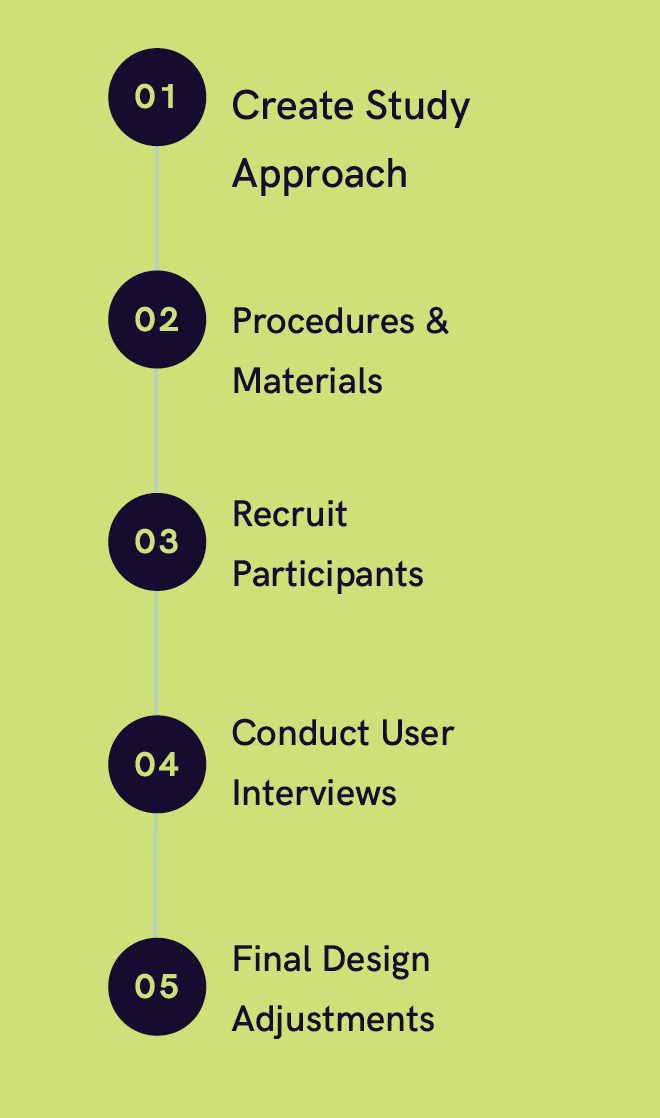
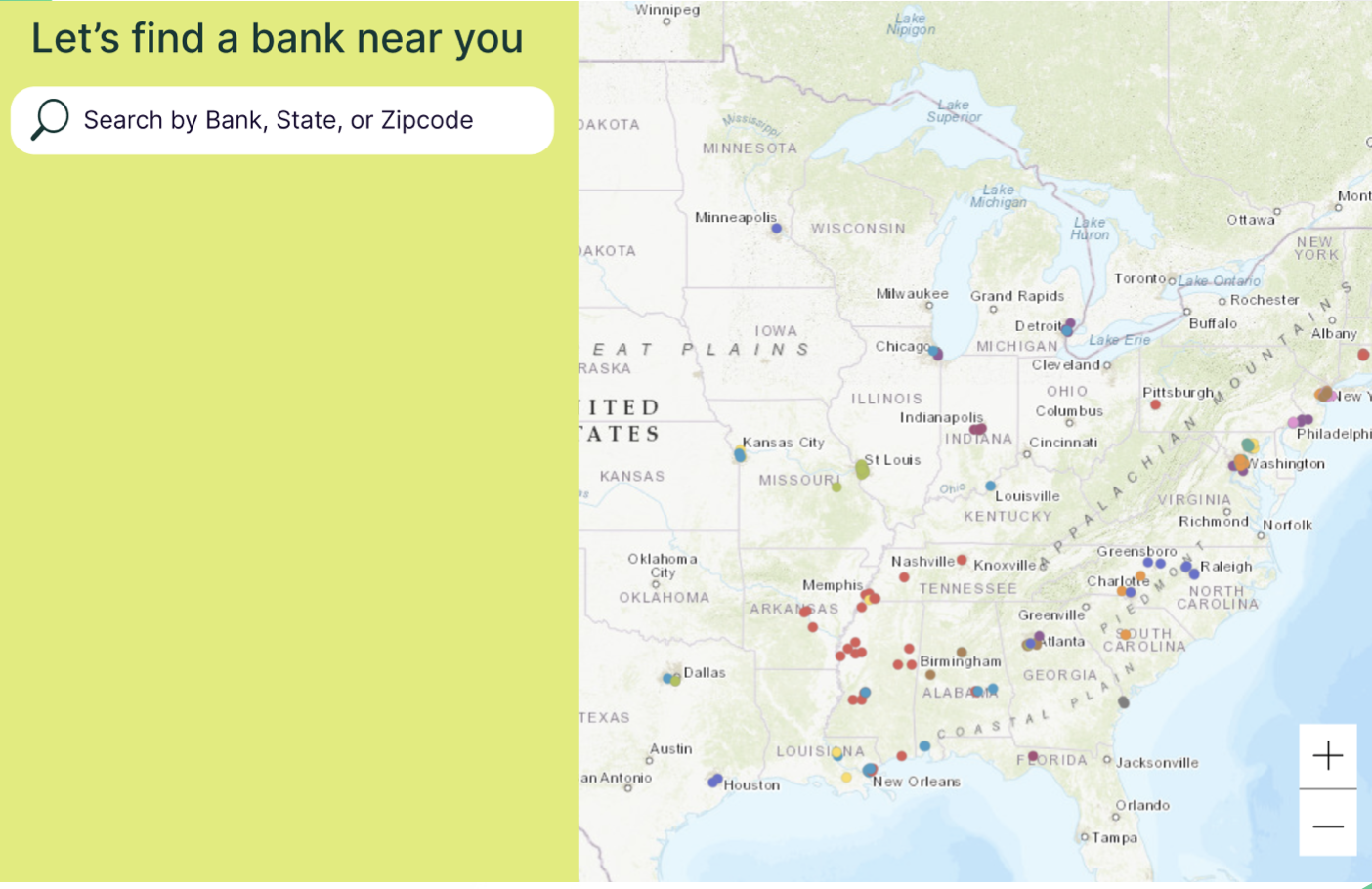
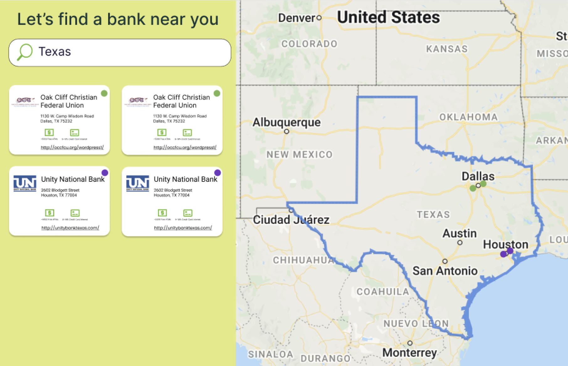
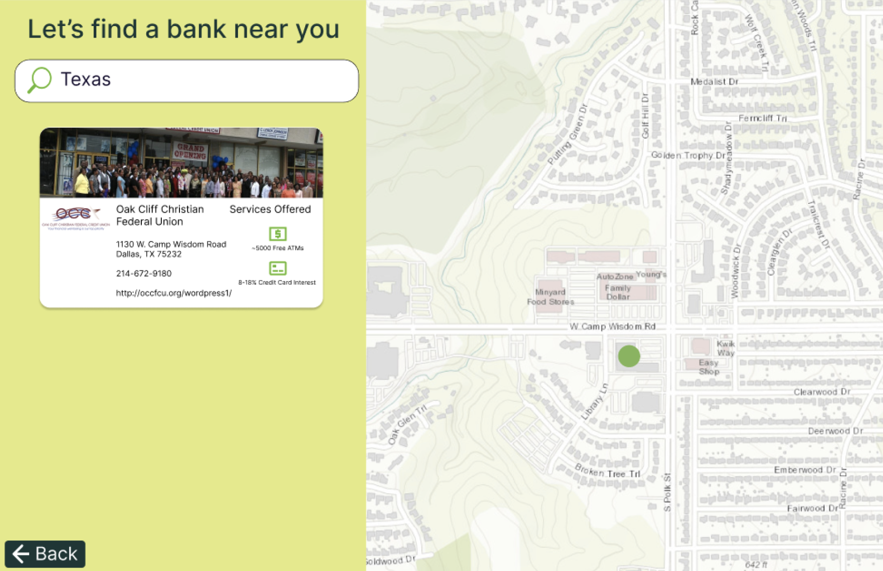
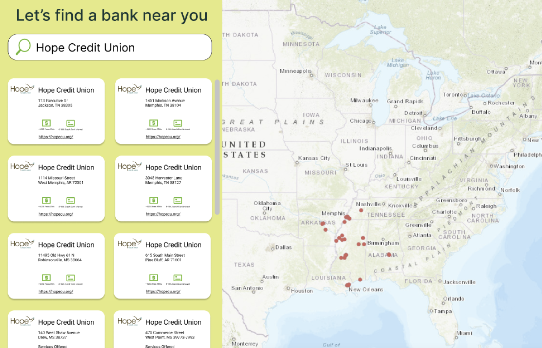
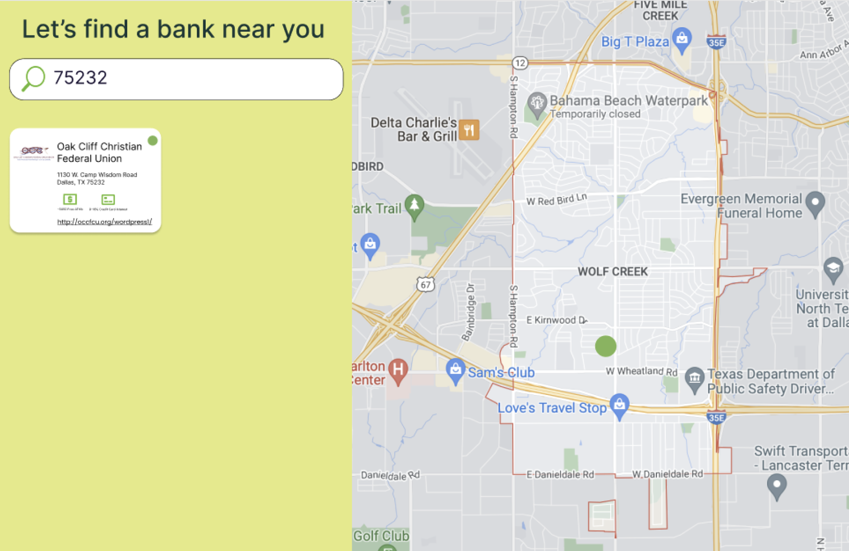
In order to gather feedback with actionable insights regarding our final design, we conducted an evaluation phase including A/B testing. We want to see which search feature fits the user's needs better, so we plan on conducting A/B testing on the old/current Black Banking Map and our final design. Our goal is to determine the difference in usability and interest in the systems. We want to evaluate whether the users' ability to navigate the map feature has improved with the new final design. In our final design, we implemented a new guided search feature that combined the old legend and search bar into one panel. A goal of this study approach is to evaluate if the new combined feature is better than the two separated features.
New User Flow
Final Design
When reviewing the multiple iterations of our key features, original ideas, and design requirements, we landed on a side-by-side design that incorporates a guided search feature while keeping the map interface. This side-by-side design satisfies multiple UX requirements that we had defined. Our user personas were kept in mind with this design iteration because it addresses the frustration of not getting effective search results from the search feature, and lends more clear takeaways about each displayed bank. This design implements a more guided search process that shows information based on their search on the left as well as the map view on the right. Users can search by location or bank name on the lefthand side of the screen and what they select will change where the map is zoomed in on. Users know the limits of what they can search for because it is clearly defined for them in the search bar.

