Communitree: Recycling & Sustainability Application
The Problem: Recycling can be a way for individuals to express gratitude for our planet, yet the current interaction experience presents too many hurdles for individuals to want to do so. The majority of individuals lack accurate information about recycling; seeking recycling information from others can be unreliable, while utilizing the internet can be too inefficient.
The Process
A breakdown of the entire design process with visual representations included below.
-
Once defining the problem we wanted to solve, we narrowed our focus to a particular audience. While it is important for everyone to learn how to accurately recycle, we anticipated most users to fall within the young adult range (18-30) as these are the most active users of mobile phones and feel responsible for taking care of the Earth. From here, we conducted interviews with individuals in this target audience to learn more about the major pain points and hurdles in the current recycling process.
-
The brainstorming of the user interactions has begun. In order to accurately organize our thoughts, we utilized post-it notes and mapped out the key interactions we wanted to design.
-
After defining our user flow, we transferred that to a paper prototype to help solidify our key interactions.
-
A visual representation of our key features transferred to digital designs.
-
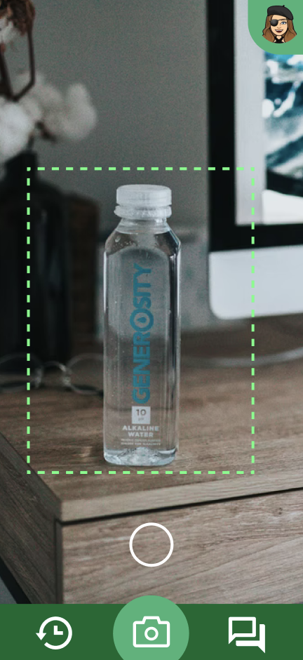
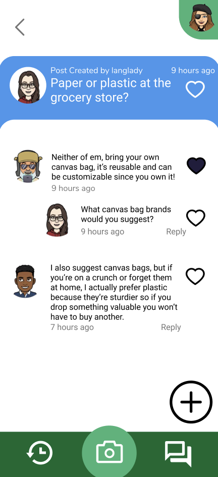
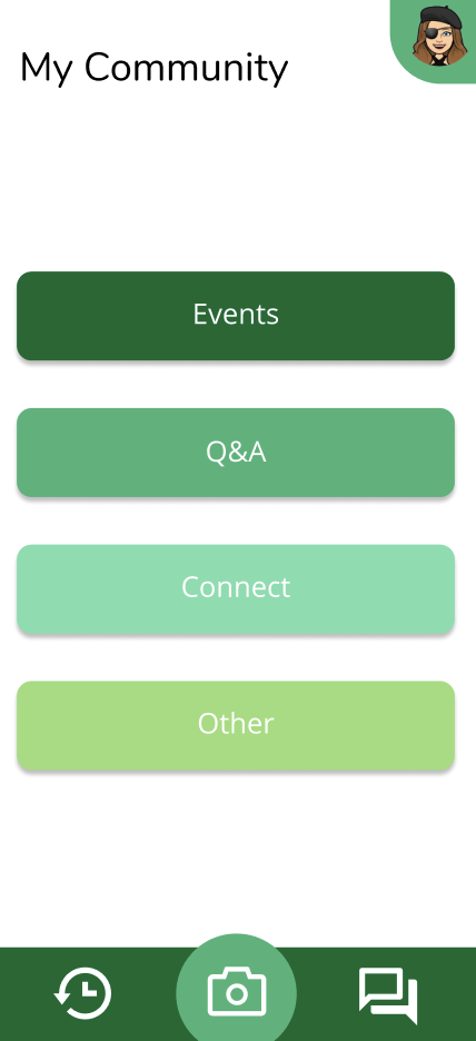
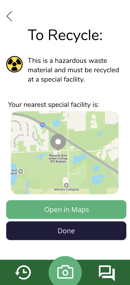
Increasing the fidelity of our wireframe, we designed out our final design and then prototyped the interactions.
User Flow
Once we solidified our key features, we mapped out a user journey through the application to see how all our features could tie together in one application. We broke down our flow into 3 categories, user actions, system actions, and tentative actions. This helped us prioritize actions actively taken by the user, then system actions, and allowed us to still consider the possibility of tentative actions without solidifying them into our final application.
Paper Prototype
We broke down our app into 4 distinct interaction buckets: scanning, profile, scanning history, and community/forum. Focusing on these 4 aspects, we drew out a paper prototype and conducted usability tests to see where users had navigational and operational issues with our current design.
Wireframes
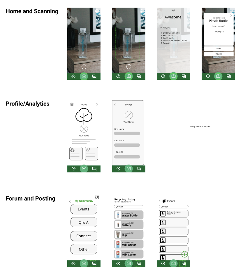
First, we transferred our paper prototype to digital screens using Figma. From there, we amplified our wireframe to include more thoughtful aesthetically pleasing choices. Once we were confident in our design, we mapped out interactions and prototyped them so users could physically interact with our screens.
Final Prototype
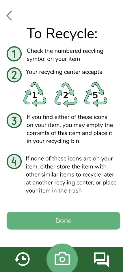
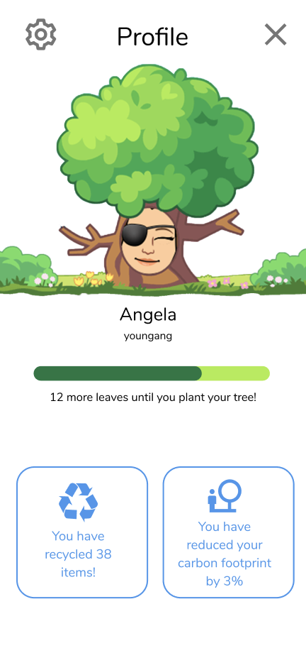
We amplified our wireframe to include more thoughtful aesthetically pleasing choices. Once we were confident in our design, we mapped out interactions and prototyped them so users could physically interact with our screens.
