The NRP Group News Redesign
The Goal:
Improving Employee Engagement
I noticed a lack of engagement in The NRP Group’s internal news platform, and made it my mission to improve engagement. The first step was to gather analytics on their news platform. How often are users clicking on an article? How many users select the News tab during their average work day? Is there any particular day users are more likely to select the News tab?
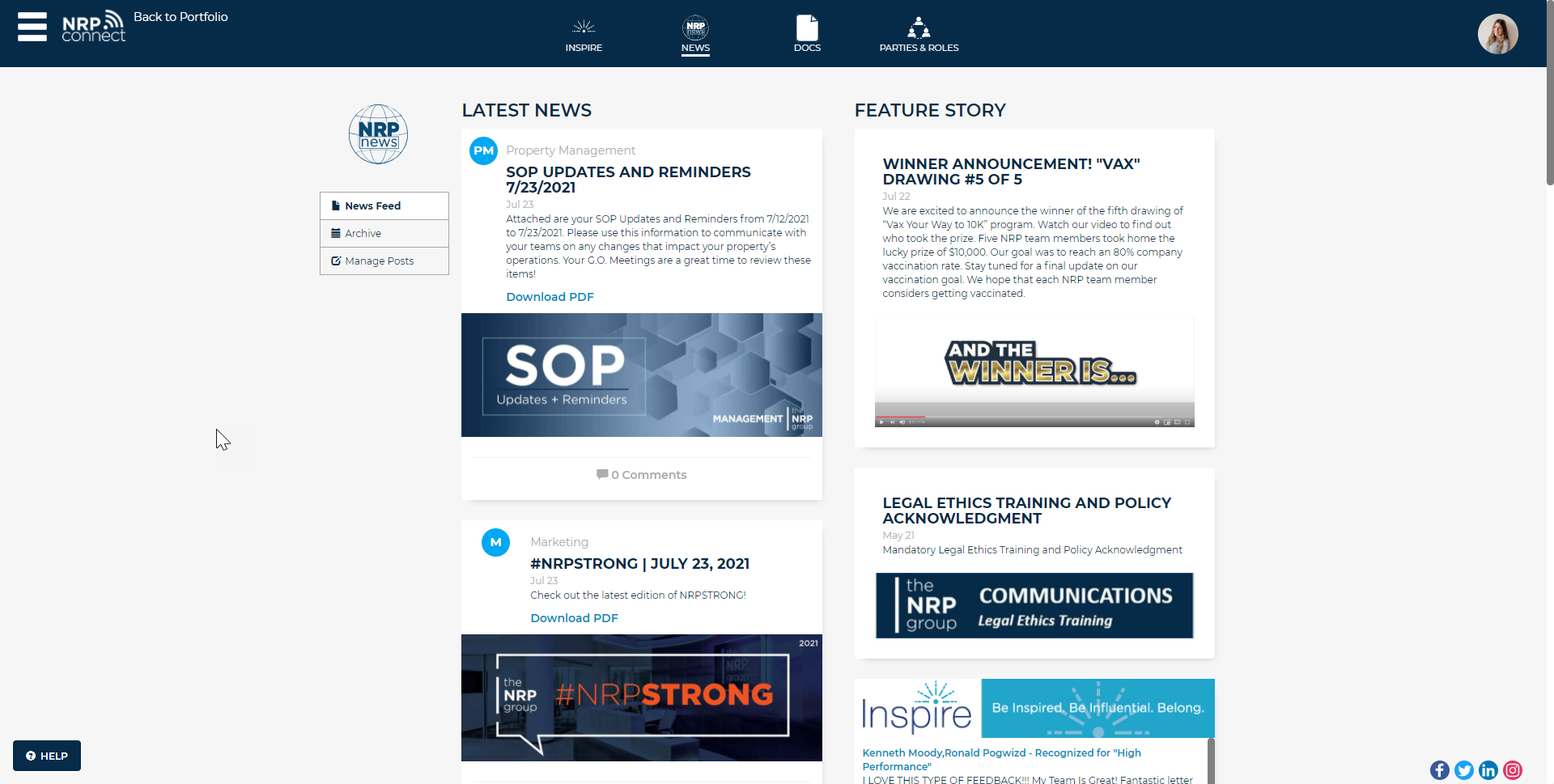
Previous NRP News

Previous UX Issues
I began an analysis of the current design of their News platform and found room for improvement. First, I noticed how the “Feature Story” column and “Latest News” column were directly next to each other, giving neither column precedence. However, the main purpose of featured stories is to have them highlighted and seen immediately by the user. There is also low user interaction on their site, as there are no comments on any of the posts. Additionally, the navigation off to the left is unclear. Unclear where it will go and does not look very important to the user.
Previous Example Post
Example post with low interaction. The process to post a comment is 3-step process, hindering the desire to make a comment. There is no way of minimally interacting with the post. There is strong verbiage to “Download PDF” when really that button leads to people the the post-specific page.
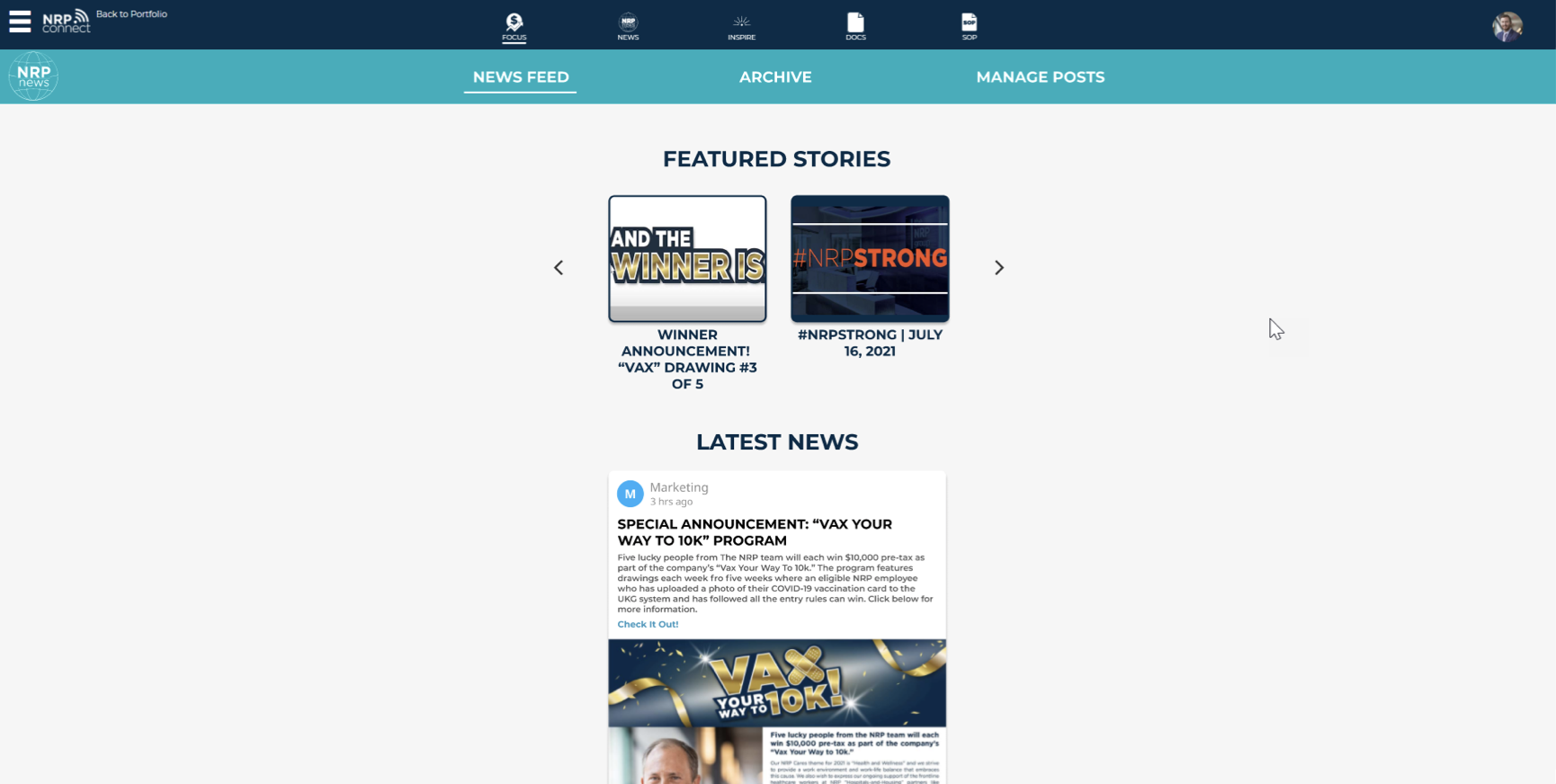
New NRP News Mock-Up
For this project, I taught myself Figma in order to design an interactive mock-up of what NRP News could look like. In the redesign, the navigation is much clearer to the user. They are better able to tell what page they are currently on, as well the header with the secondary NRP color promotes importance of the navigation. Next, I wanted to give precedence to the “Featured Stories.” I decided to make them into a card carousel, giving the users more incentive to click on them to get the full story. By giving the featured stories vertical precedence, I was able to make the news feed wider, taking up more of the users screen.
NRP News Post Redesign
In my redesign, I tackled smaller nitpicking details. I wanted to add a like button to make it easier for users to engage with company content. As well, I made the comment section more personalized, with an image and less metadata than the current version. Adding a share button was also important to the redesign as it would be easier for employees to share exciting information with each other. Finally, I grouped the metadata of the post at the top, and changed the verbiage from “Download PDF” to “Check It Out!” The word “Download” is a strong action word that is associated to computer clutter, and I did not want that word to dissuade users from clicking on the post.
What I learned
I learned the value of starting fresh. I came to NRP with no in-depth knowledge about their internal news platform and brought fresh eyes and ideas to the platform. While creating this project, I oftentimes got frustrated at my limitations, “no content passed this line”, “our backend framework does not support that” and others. However, I found ways to design within the limitations as well as make suggestions for the future, suggestions without restrictions. Overall, this project was very rewarding as I taught myself Figma, and efficiently create a new and improved interactive system for The NRP Group’s internal news platform. I presented this project to the CEO and CIO at the end of my internship and received positive feedback.
Limitations do not need to be setbacks.


